Modern forex trading is considered to be impossible without forex charts. Those two go hand in hand, and will for quite some time. A forex chart is a must, regardless of whether a trader is planning to analyze live forex charts or have someone else crunch the numbers in their stead. Forex chart patterns are more than just pretty pictures on your screen and can represent the difference between success and failure. So it is absolutely critical for any forex trader to learn as much as possible about forex charts analysis before getting into this business.
Forex Charts Basics
Well, a chart is basically a graphical representation of a certain collection of data. Taking a bunch of data on currency pairs, like opening and closing prices, periods of time, highest and lowest prices achieved etc., and presenting them in a visual format, say in the form of a chart gets you – a forex chart. And if the price action is happening in real time, we are talking about live forex charts.
How to Analyze Forex Charts?
There are three basic types of forex chart. First is the line forex chart, second bar forex chart and finally the candlestick forex chart.
Line Forex Chart
A line forex chart is basically a forex chart with lines connecting closing prices. When all the closing prices in a chart are connected in a single line, we can analyze the forex chart patterns for the general movement of the price of the underlying instrument. And since we are talking about forex charts, it goes without saying that the underlying financial instrument is a currency pair, as seen on the example (see picture 1).
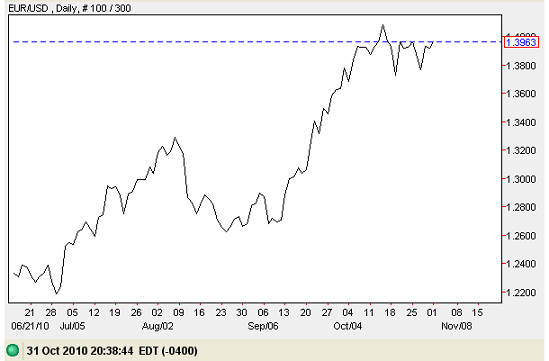
Picture 1 – Forex Charts
Here we can see an example of a line chart for a currency pair; the pair in question is EUR/USD: the price action has its ups and downs, but the overall trend is upward.
Bar Forex Chart
Unlike line charts, a bar forex chart shows both highs and lows, in addition to opening and closing prices. The top of the bar represents the highest price of a currency pair that was reached, while the bottom of the vertical bar stands for the lowest price that was recorded during the period. The actual vertical bar stands for the overall trading range of a currency pair. The horizontal hashes on the sides of a bar also have a meaning of their own. The opening price is the hash on the left and the one on the right signifies the closing price, so all there is left is to identify any forex chart patterns.
Picture 2.1 is the schematics, whereas a real-life example would be something like the picture 2.2. In 2.1, the “Open” stands for the opening price, as indicated by the small line on the left. The “Close” is indicated by the horizontal line on the right, as you might have guessed. The “High” and “Low” are the top and bottom price reached during the time period, respectively.
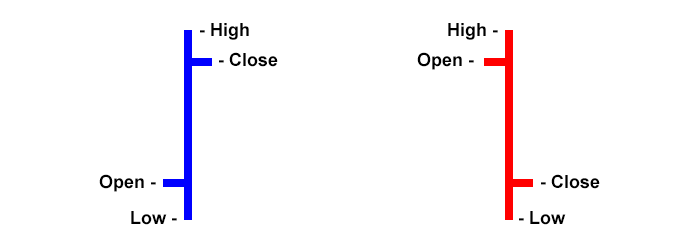
Picture 2.1 – Forex Charts
Remember, every single bar on the chart stands for a collection of data and has a meaning of its own. In fact, every element of a forex chart has a meaning, whether we are talking about currency charts, live forex charts or any type of chart that can be used in forex charts analysis. Every bar in this type of forex chart, for instance, tells you the open, high, low and close for a currency in a certain time period. This is why this forex chart is also abbreviated to OHLC. The initial letters for the type of data it provides and any forex chart patterns that might emerge come from these.
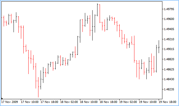
Picture 2.2 – Forex Charts
Candlestick Forex Chart
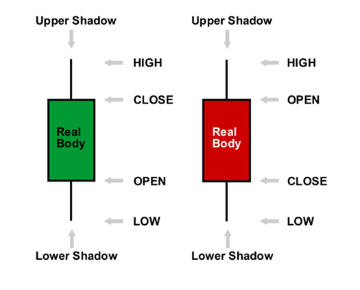
Finally, the most commonly used type of forex chart – the candlestick forex chart. Essentially, these give you all the information you can find in a bar forex chart, only it comes in a package that is more visually appealing and easier to interpret. This also meant forex charts analysis is easier with this type of chart. The difference between the high and low price is still indicated with the length of the bar on a candlestick. The exception and the main difference is that the middle of the candlestick is used to indicate whether the currency pair closed higher or lower than it opened.
This way of representing data in currency charts takes one part of the equation right off the bat, as a trader can deduce the direction of a price shift before even gauging the high and low prices, saving time and making forex charts analysis that much quicker. This type of forex chart features bars that are either ‘filled’ or ‘hollow’ – usually black stands for filled and white for hollow, as you can see in picture 3.1. Full bars mean the closing price is higher than the opening one and hollow bars indicate that the closing price is lower than the opening one.
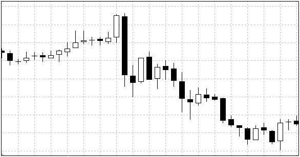
Picture 3.1 – Forex Charts
However, many candlestick forex charts – especially live forex charts – are colored, like the example in picture 3.2. In most live forex charts – and forex charts in general – there are different color options, usually chosen by the owner of the platform where they are available. As for colored forex charts, green means filled and red stands for hollow. It should be said that bar forex charts also employ a similar principle in order to facilitate easier forex charts analysis, although they still seem to be losing to candlestick charts in terms of popularity.
Picture 3.2 – Forex Charts
When analyzing currency charts, speed and reliability is everything; you need to grasp a general situation quickly, especially when dealing with live forex charts. The beauty of candlestick charts is that you can gauge the overall trend without even looking at the actual price action. Just by looking at the color of the bars, you can gauge the general direction of a trend, provided there is one to be gauged in the first place. The more green you see, the stronger the upward trend of the currency pair in question. Consecutively, the more red you see, the stronger the downward trend. Even the possible reversal points are easier to identify, and at a mere glance, too.
Even though the only ‘real’ advantage they hold over other types of forex charts is their visual appeal, it seems this very quality is what made candlestick charts so popular for forex charts analysis. However, things are actually more complex than that, and the list of advantages of forex charts does not end here.
The Advantages of Forex Charts
There is a reason why live forex charts have become irreplaceable in modern forex charts analysis. Most of these forex charts are straightforward and easy to interpret. Too easy, some would say, as traders are becoming too dependent on what the charts are telling them and neglecting other types of analysis. In any case, forex charts are easy to interpret, but hard to predict.
They can help traders determine crucial moments and identify trends. They also serve as a visual aid, summing up copious amounts of data into a nice, compact package that is easy to interpret and use. The best part is that most of these charts are made automatically and are available on almost any trading platform. The only real downside is picking the right one and interpreting it properly. The interpretation part will receive due attention in a little while, but it is far more important to make sure the forex charts being used are legitimate; otherwise, the forex chart patterns will not be accurate and the forex charts analysis will not be reliable.
Forex Charts Online
 The fact is that most of forex trading is done online, so the majority of currency charts must also be available online. This brings a whole new dimension, as not all brokers – or live forex charts they offer – are legitimate. Of course, most frauds get discovered relatively early on, but this is of little comfort to those they swindled. In order not to fall prey to these frauds, it is imperative to know where and how to get the right forex charts. Or, should I say, which forex charts to choose.
Most brokers employ platforms with some level of charting options, so creating, analyzing and interpreting charts should not be that much of an issue, as long as the data feed is legitimate. A good advice would be to try out charting packages and find the one that suits your purposes the best. Other than that, most reviews on forex brokers also deal with the quality of charts they offer, among other things.
Of course, there are sites that offer free forex charts, or they can at least offer you a deal: sites such as DailyFX or Investing. But the main part is not getting your hands on a forex chart. Actually, it is the forex charts analysis that need concern you the most.
Interpreting and Analyzing Forex Charts
Analyzing currency charts is just as important as getting the right tools for the job. After all, no accurate forex charts analysis can be done if the forex chart patterns are inaccurate. Also, having the best and clearest forex chart patterns is useless to someone who does not know how to make use of them.
 In essence, there is no single, foolproof way of analyzing currency charts. Some forex traders focus on the fundamental approach, trying to incorporate currency charts into their own prognosis, based on factors such as interest rates, employment, inflation, political situation and the overall state of the economy, which can greatly affect the value of a currency – either in a positive or a negative fashion. The main sources of information for such traders would be news outlets and various texts by analysts from around the world, while currency charts would primarily serve to prove their suspicions or refute them entirely.
On the other hand, a technical forex trader would rely heavily on live forex charts and combine them with various technical indicators in order to predict future price action. To whatever extent possible given the circumstances! Either way, the actual price is dictated by supply and demand, and the only way to gauge it is via live forex charts, so learning to interpret them is definitely a priority.
Regardless of which broker provides the actual service, the first thing to do is – you guessed it, to open the chart. In order to do that, one would have to specify the currency pair, the data range as well as the period for which the chart would be updated. For instance, if you set the period to be one day, then each point on the currency chart will stand for a day’s worth of data, whereas a five minute period means the chart will add a new point every five minutes. The data range determines the overall amount of data you require. The longer the range you choose, the more data the chart will contain.
Naturally, if your strategy involves frequent trading and not holding on to your positions for an extended period of time, it would serve little purpose to analyze the data from five years ago. Also, long-term trades should not be based on five-minute period currency charts. Once again, it all depends on the trader and his or her strategy.
Regardless of what type of trader you are, the most commonly used type of forex chart is the candlestick forex chart, so learning to read these can be considered a priority. Experienced traders can gauge price action off a candlestick chart in a single glance, although beginners should probably pay more attention than that. In any case, the basics of interpreting these charts as well as their elements have already been covered, so it makes little sense to repeat it.
Uptrend
What has not been covered, however, is adding indicators onto existing charts. These are the favorite tools of technical traders, and most brokers have a selection of indicators which are already available to their clients right off the bat, with hundreds more available for downloading on the internet. There should be an ‘add indicator’ tab somewhere, so the entire process is relatively straightforward and self-explanatory.
Downtrend
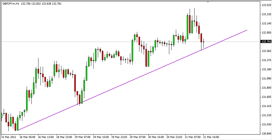
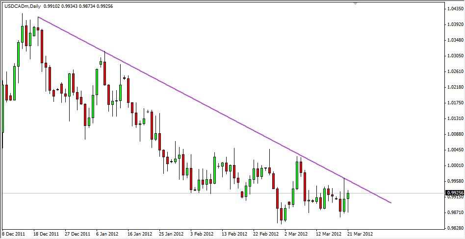
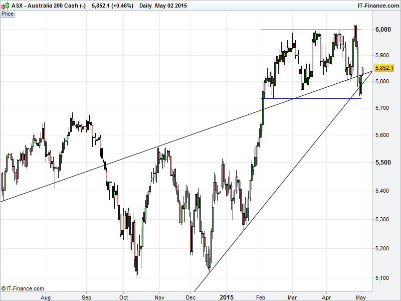
The final part is to identify a trend and to draw the corresponding trend line. Essentially, there are upward, downward and horizontal trends, and each of them can be exploited, provided you know what to do. Typically, there is a pencil tool that can be used to draw the actual trend line, and once in place, they should help traders determine their course of action. Here are some examples of upward, downward and horizontal trends.
Horizontal
Summary
The sheer subject of these charts is an incredibly complex one, and cannot be broached by any single text. Analyzing currency charts may seem like an exact science, but it is far from it. The main reason is that currency charts show forex chart patterns and little else. In other words, they focus on what was, or what is, rather than what will be. Depending on what kind of trader you are and the strategy you employ, forex charts can be indispensible or optional, but you will need them just the same.

